Case Study
Little Bites
A product-led brand website with CMS-friendly content sections, reusable front-end patterns, and clearer product storytelling.
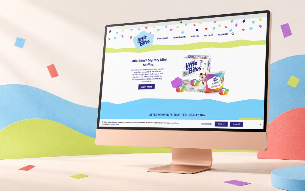
Overview
Little Bites needed a digital experience that could feel playful and product-focused while still making information easy to browse, update, and scale across campaign pages.
The problem
The product experience needed to support different user needs at once: quick product discovery, brand storytelling, campaign content, and easy content management without adding unnecessary complexity for visitors.
My role
Key decisions
- Kept page structures modular so content could be reused across campaigns.
- Made product information scannable before adding supporting brand detail.
- Used consistent spacing and hierarchy to keep playful visuals from becoming confusing.
- Protected mobile usability by keeping key actions and content easy to reach.
- Kept the front-end implementation maintainable for future updates.
Technical approach
I focused on reusable page patterns, clear content hierarchy, and responsive layouts that worked well on smaller screens first. The implementation balanced brand personality with practical CMS structures so the site could continue evolving after launch.
Accessibility considerations
Responsive layouts, semantic structure, and readable typography support browsing across devices. Interactive elements were implemented with keyboard access and clear visual hierarchy in mind.
Outcome
This created a smoother browsing experience for families and gave the brand a more maintainable foundation for product content and campaign storytelling.
What I learned
This project reinforced how small layout and interaction decisions can make a large consumer website feel simpler, calmer, and easier to navigate.